
Logo design
A mark that survives the real world.
A logo is judged in a presentation at full size on a white background and used at the size of a browser tab, embroidered on a shirt, etched into a window and printed in one colour on an invoice. Designing for the first situation and not the others is the most common way this goes wrong.


What makes a logo work in practice?
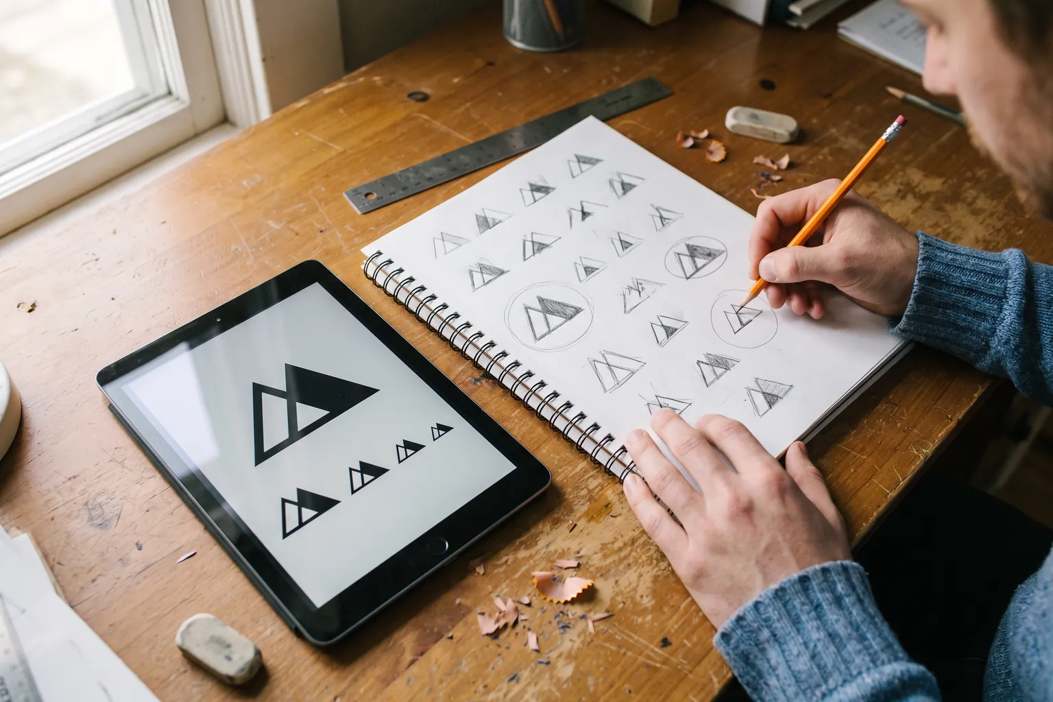
It has to remain recognisable when reduced to a browser tab icon, reproduced in a single colour, reversed out of a dark background, embroidered, and read from across a car park. Marks that only work in full colour at large sizes fail exactly where it matters.
It has to be distinctive within your own market, which is a lower bar than being globally original and a higher bar than looking professional. If three competitors could use it unchanged, it is not doing the job.
And you have to receive the vector source files and the rights to use it, or you do not really own it and every future change goes back through the same designer.
Written and maintained by the VIS Mountain team. Last reviewed . The sources behind it are listed below.
What a logo is and is not
A logo is an identifier. Its job is to be recognised and attached to whatever people already think about you. It does not communicate your values, explain your services or persuade anybody of anything, and designing as though it should is how you end up with a mark containing four ideas and legible at none of them.
This matters because it lowers the pressure on the design and raises the pressure on the practical constraints. The question is not whether the mark expresses your philosophy. It is whether somebody will recognise it on a van at thirty miles an hour and again in a search result two weeks later.
The corollary is that simple marks win. Not because minimalism is fashionable, but because a simple shape survives reduction, reproduction and reversal, and a detailed one does not.
The other consequence is that a logo cannot rescue a business nobody has heard of. Recognition is built by repeated exposure, and the mark is what the exposure attaches to. It is the hook, not the fish.
How the work runs
Designing before the positioning conversation produces a taste argument rather than a decision.
Establish what it has to work on
Before anything is drawn: signage, vehicles, uniforms, print, digital, and anything unusual to your trade such as equipment labels or clinical packaging. Each of these constrains the design, and finding out afterwards that it has to be embroidered is expensive.
Look at the market you are actually in
Not to copy and not to avoid on principle, but to know what the visual conventions of your category are and where the space is. Every dental practice in the area using the same blue is useful information.
Design in black and white first
If the mark does not work without colour it does not work. Colour is added once the shape holds on its own, which prevents a design whose only distinguishing feature is a gradient.
See the remaining steps: How the work runsHide the remaining steps: How the work runs
Break it deliberately
Reduce it to sixteen pixels. Print it in one colour. Reverse it out of black. Stitch it, or at least simulate the stitch. Put it on a photograph of a van. Most concepts fail at least one of these and it is far better to find out now.
- Full colour, single colour and reversed versions
- A simplified mark for small sizes if the main one needs it
- Horizontal and stacked arrangements for different spaces
Present with reasoning
Concepts shown with the thinking behind them and in real contexts rather than as artwork on a white slide. A review that becomes a matter of personal taste is a review in which whoever is most senior wins, which is not the same as the best outcome.
Hand over everything
Vector source files, exports in every format you will need, the colour specifications for print and screen, the font licensing position, and written clarity that the rights are yours.
A logo project is weeks rather than months. The positioning conversation before it is what takes the time.
Five places your logo has to survive
A logo is approved on a screen and then lives everywhere else. These are the five places we check before calling one finished.
What to check before approving a logo
Every one of these has caused a real, expensive problem for somebody.
- Ask to see it at sixteen pixels. That is the size it appears at in a browser tab and in some search results.
- Ask to see it in one colour, black on white and white on black. Signage, faxes, stamps and embroidery all need this.
- Ask to see it on a photograph of a vehicle and on a shirt, not on a white slide.
- Check whether the text is still legible when the whole mark is the width of a business card.
- Ask what font it uses, whether that font is licensed, for what uses, and in whose name.
See the full checklist: What to check before approving a logoHide the full checklist: What to check before approving a logo
- Search the United States Patent and Trademark Office database for anything similar in your category.
- Confirm in writing that you receive the vector source files and the rights to use the mark commercially.
- Check that it does not look like the market leader in your category, which is a compliment nobody wants to receive.
The font licensing question surprises people most often. Typefaces are licensed rather than owned, and a licence covering desktop use does not necessarily cover a website or a product.
Types of mark, and what each one costs you
There is no best type. There is a type that suits how well known you already are and how you will be seen.
| Item | Works when | Costs you |
|---|---|---|
| Wordmark | The name is short and distinctive | Nothing to use when there is no room for words |
| Lettermark | The name is long, initials are memorable | Meaningless until people know you |
| Symbol plus wordmark | You need something that works without the words | Two things to design well instead of one |
| Symbol alone | You are already widely recognised | Almost never right for a local business |
The last row is the most common ambition and the least appropriate choice. A symbol with no name attached only works once people already know what it stands for.
What you should receive, and why each one matters
Vector source files are the master artwork. They scale to any size without losing quality and they are what a sign maker, an embroiderer or a printer will ask for. If you only receive image exports, you do not really control your own logo.
Exported formats for everyday use: scalable graphics for the web, transparent versions for placing on photographs and coloured backgrounds, and high resolution versions for print.
Read the full breakdown: What you should receive, and why each one mattersHide the full breakdown: What you should receive, and why each one matters
Colour specifications in each system: one for screens, one for print process colours, and one for spot colour where signage or merchandise requires it. Without these, your colour drifts between suppliers and nobody can say which version is correct.
Every version of the mark: full colour, single colour, reversed, and the simplified small size variant if there is one.
And a plain statement of the font licensing position: which typeface, what licence exists, what uses it covers and whose name it is in. This is the item most often left undocumented and the one most likely to cause a problem two years later.
We do not publish a price for this piece of work on its own, because the right scope depends on what already exists. What is published is the bundle pricing: 2,400, 3,600 or 4,800 dollars a month depending on which channels are running. You can read the full breakdown on the pricing page, and you will get an exact number in writing before anything starts.
The trademark question
A logo you intend to build a business on is worth checking for conflicts before it goes on signage.
The United States Patent and Trademark Office runs a free public search of registered marks. Searching it for your name and for visually similar marks in your category is a sensible step and takes an afternoon.
We will run that search and flag anything obvious, and we will tell you where a name or a mark looks risky. What it does not produce is a clearance opinion, which is a different piece of work done by a different profession. For a mark you plan to invest in seriously, a trademark attorney is worth the fee, and the cost of finding a conflict after the vehicles are wrapped is considerably higher.
Common law rights also exist without registration, which means a search of registered marks alone does not guarantee a clear field. That is another reason the judgement belongs with a lawyer rather than a designer.
How you know it worked
Logo design is not measured by engagement on the announcement post, and anybody offering that as evidence is measuring the wrong thing.
The signals that mean something are practical. Does your own team stop asking which version to use. Do suppliers stop sending back artwork that does not work. Does it reproduce correctly on the first attempt at the sign shop.
Over a longer period, the mark contributes to recognition, which shows up as branded search volume and direct traffic rather than as anything attributable to the design itself.
The most honest statement available is that a good mark removes friction and supports recognition. It does not generate demand, and any designer telling you otherwise is selling something.
How this connects to the rest
A logo on its own drifts. Brand identity systems is the piece that gives it colour, type, spacing rules and the documentation that keeps every future touchpoint consistent, and most businesses that think they need a logo need that instead.
Graphic design work is where the mark gets applied repeatedly once the system exists, which is when the practical constraints either hold or fail.
Web design is usually the first place a new mark appears at scale, and the colour work has real consequences there, since a palette that cannot produce readable contrast makes every page harder to build.
If a name change is involved rather than just a new mark, the search consequences belong in the decision, and that conversation sits with the branding hub.
Bring what you have and we will stress test it.
Send us your current mark and we will show you how it holds up at sixteen pixels, in one colour and on a vehicle. That usually settles whether you need a new one.
Straight answers.
Do I own the logo?
You should, and it should be in writing. You receive the vector source files and the rights to use the mark commercially.
Fonts are the exception worth understanding, because typefaces are licensed rather than owned. We will tell you exactly which licence is needed and whose name it should be in.
How many concepts will I see?
A small number, developed properly, rather than a large number presented thinly. Three well reasoned directions shown in real contexts is more useful than twelve variations on a slide.
Volume of concepts is a sales feature, not a design one.
Can you just redraw our existing logo?
Often yes, and it is frequently the right answer. If the mark is recognised and the problem is that nobody has the source files or it does not work at small sizes, redrawing and rationalising it preserves the recognition you have already paid for.
Throwing away an established mark for a new one is a real cost, and it should be a deliberate decision.
Do you check trademarks?
We search the United States Patent and Trademark Office database and flag anything obvious, and we will tell you where something looks risky.
That is not legal clearance. Common law rights exist without registration, so for a mark you intend to invest in, a trademark attorney is the right call.
What file formats do I get?
Vector source files as the master, scalable graphics for the web, transparent versions for placing on photographs, high resolution files for print, and colour specifications for screen, print process and spot colour.
Plus every version: full colour, single colour, reversed, and a small size variant if the mark needs one.
Where this comes from.
Primary documentation and published research behind the guidance on this page.
- United States Patent and Trademark Office, trademark basics (opens in a new tab)
- FTC truth in advertising (opens in a new tab)
- WCAG 2 checklist, WebAIM (opens in a new tab)A practical summary of the Level A and AA success criteria.
- WebAIM contrast checker and guidance (opens in a new tab)
- Schema.org vocabulary (opens in a new tab)
Talk to the team
A short call, a look at how the business currently shows up, and a straight answer on what we would do first.